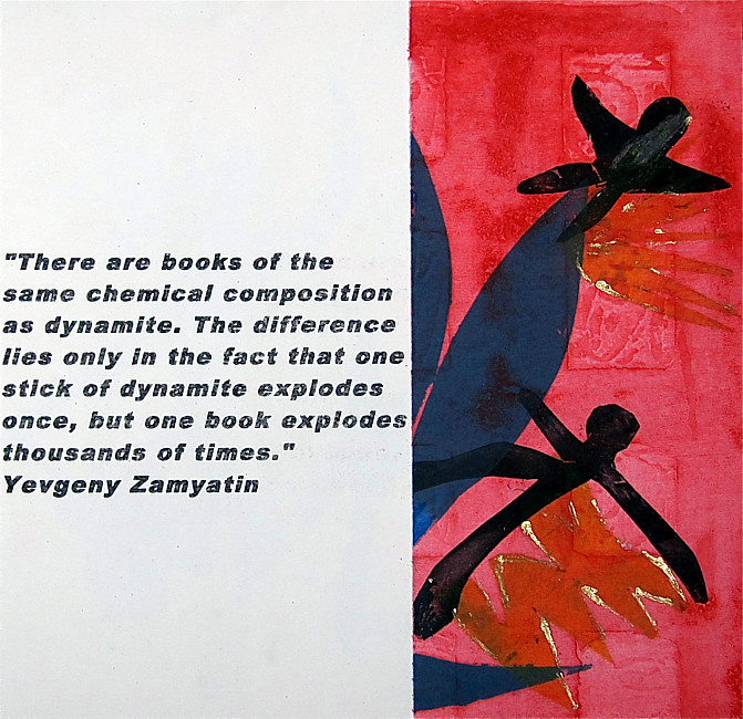
"Celsius 232.7777777777778“ The temperature at which books burn.
Marguerite Ryser, Switzerland

| “Celsius 232.7777777777778“
The temperature at which books burn; Marguerite
Ryser, Geneva, Switzerland, March 2013 For the project Al-Mutanabbi Street Starts Here, Ray Bradbury's Fahrenheit 451, the temperature at which paper burns, was the source of inspiration. The texts are of nine quotations, in English, stating the importance of books and the danger of burning them. The background pages are composed of red squares representing blood. These pages are cut into two parts leaving the text to be exposed in between. The three superimposed symbols printed on this surface are people, flames and books, which are alternatively blue, yellow (lined with gold) and black. The cover is black with the same symbols. (yellow, red and white) Dimensions: 20 x 21 cm; Medium: Background, hard cardboard printed on paper (Zerkall 250gr), S uperimposed images, soft cut out acetate (ink- nontoxic water inks) Born in s'Hertogenbosch, The Netherlands, Marguerite Ryser went on to live in South Africa during her childhood and adolescence and only came to Switzerland for her Post Graduate studies. After having worked in several print studios in Geneva, and followed courses and professional workshops, she opened her own studio Amartistes, in 2004. However, for works of larger dimensions she prints at the Atelier Genevois de Gravure Contemporaine. Here she was a member of the committee from 2002 - 2006 and was President of the Association until 2011. Participating actively in International and national Print Biennials as well as ex-Libris competitions, she has been selected to exhibit her works all around the world. Having had a literary education, she has invested much of her time lately in the creation of artists' books and has participated in different meetings in this medium (Marseille, Vilnius, Geneva and Lausanne). Approach to artist's books: according to the subject matter, she uses the technique corresponding the best to the artistic creation. For very small books, lino print; and for books with a poetic text she uses typography and copper etching (eau-forte, aquatint or sugar lift). With certain works she superposes prints and uses collages. georges.ryser@sunrise.ch |